Zuick InnerAir™
Building a premium kids’ innerwear brand that speaks to mothers, without looking like a kids’ brand.
Overview
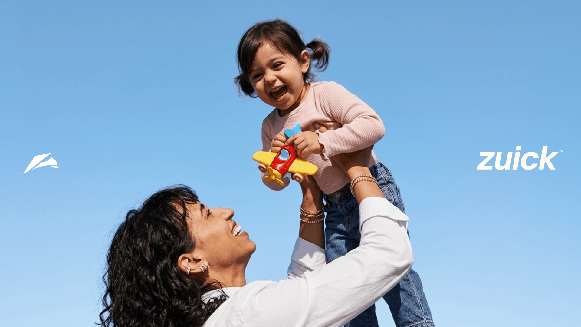
Zuick is a new kids’ innerwear brand built around comfort, lightness and freedom of movement. The ambition was to create something premium and performance-led — positioning the brand somewhere between Nike and Uniqlo, but for kids.
Creative Direction
Logo Design
Brand Identity
Packaging
The Challenge
The category was filled with colourful, cartoon-led brands that communicated “kids” in very familiar ways. Zuick wanted to charge a premium and appeal primarily to mothers, while still feeling approachable enough for a brand founded by one.
The Approach
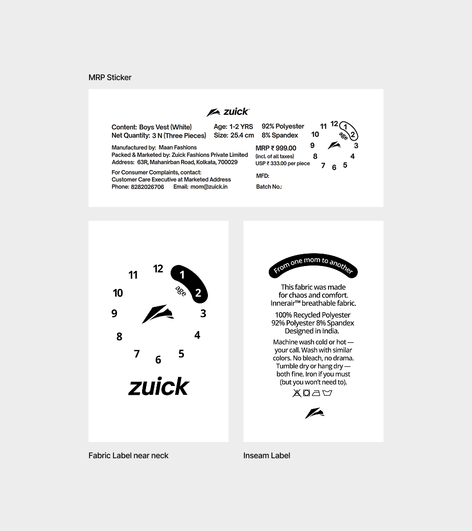
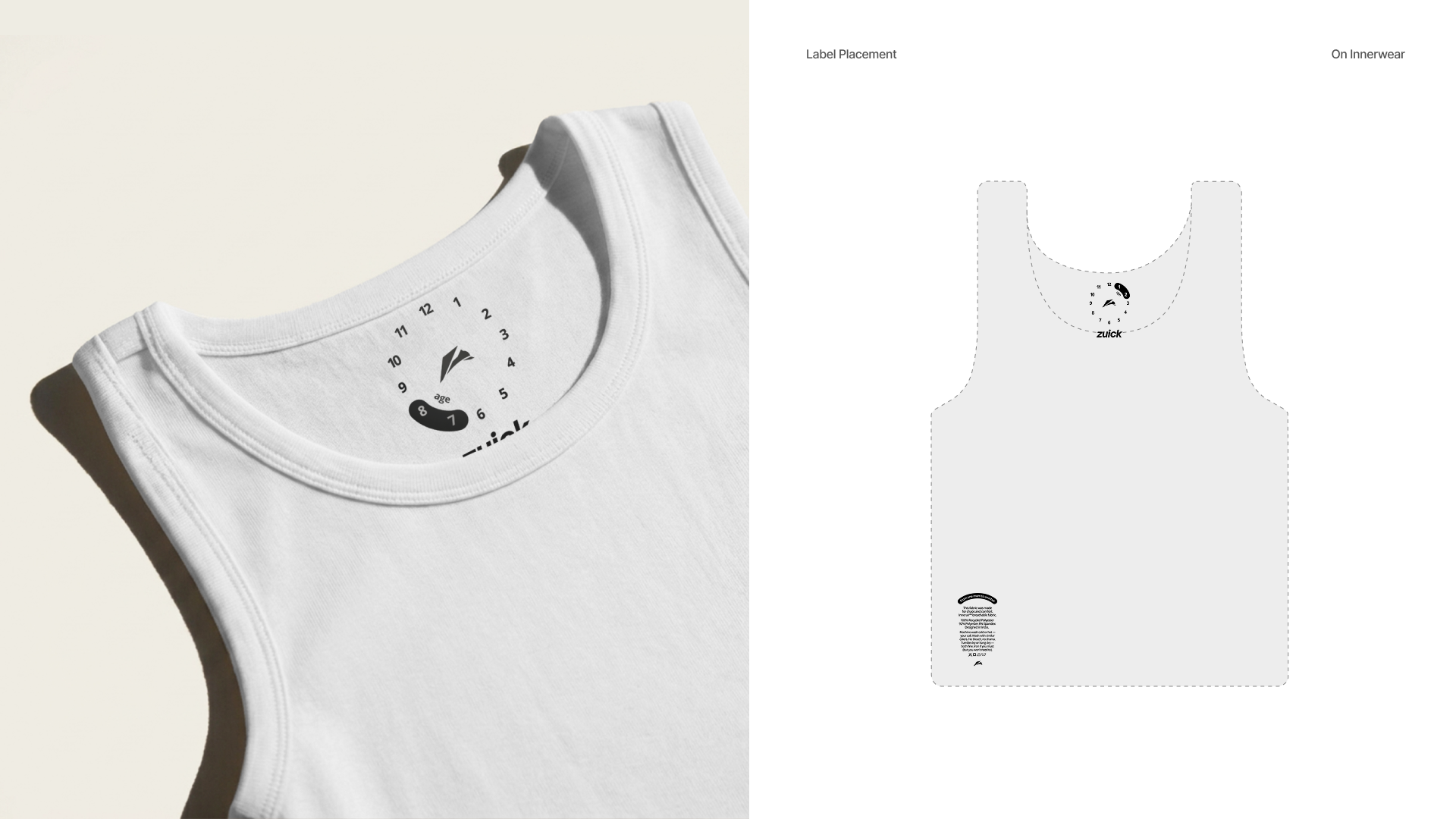
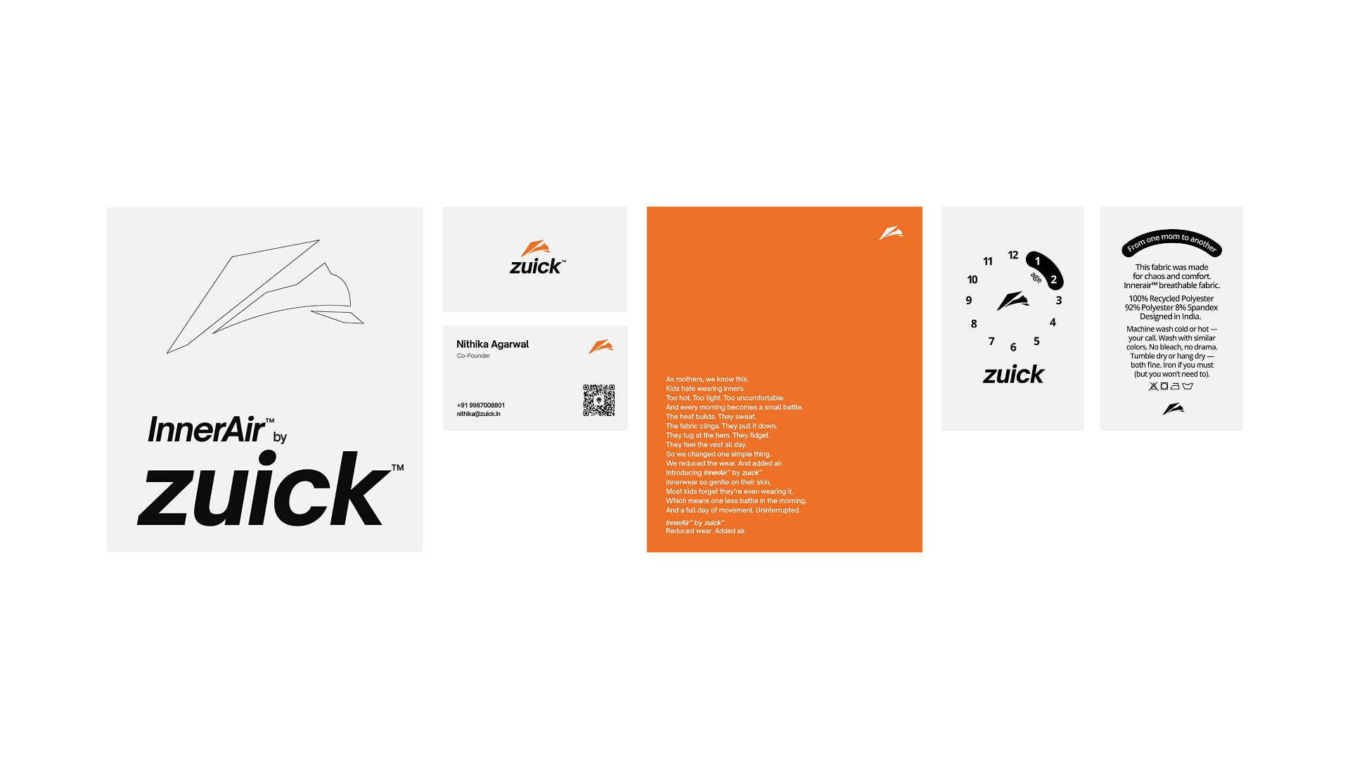
We deliberately moved away from typical kids’ branding and built a clean, minimal visual language. Off-white and charcoal created a more sophisticated foundation, while electric orange brought energy and movement. The identity needed to feel mature without becoming cold, reflecting both the product's performance and the energy of young kids.
The Outcome
Zuick launched with an identity that stood apart from the category without trying to hide that it was made for kids. The result balanced the mother's expectations of quality and sophistication with the energy and comfort at the heart of the product.
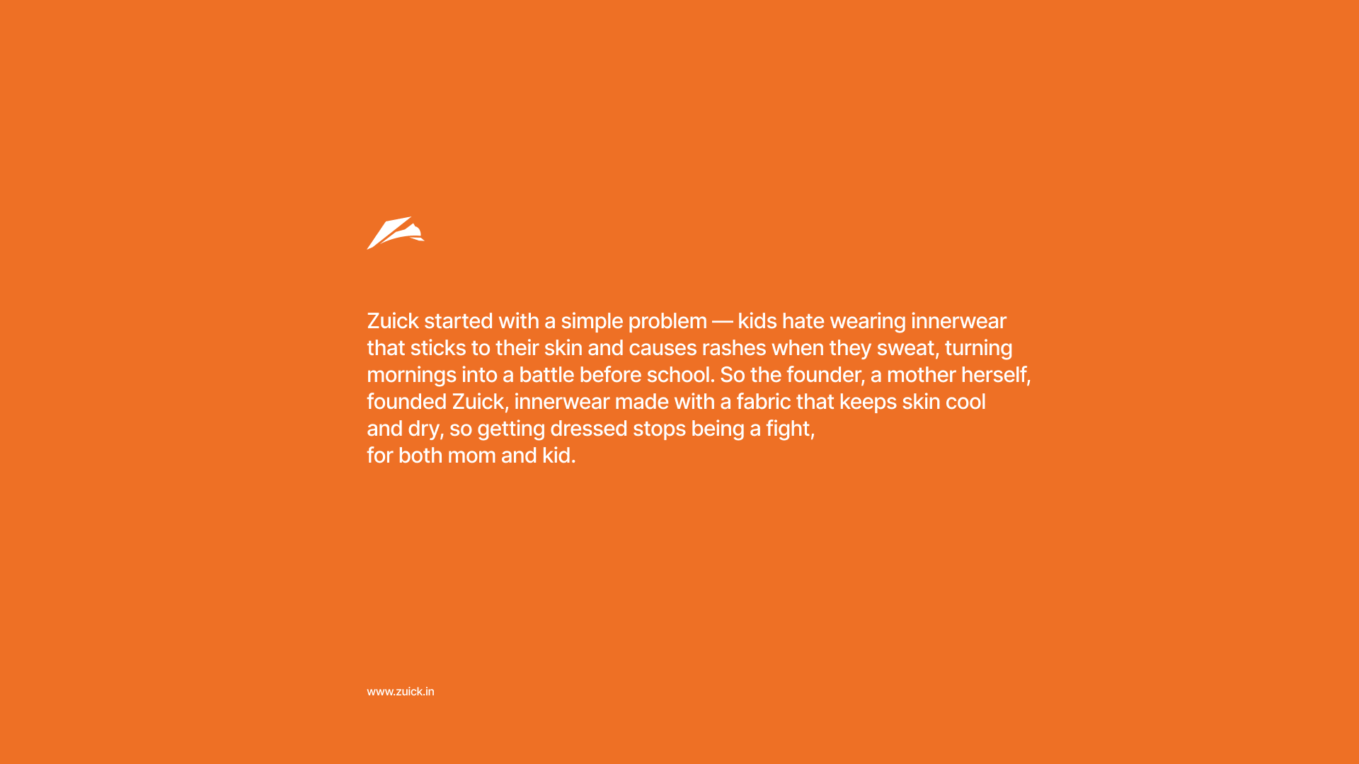
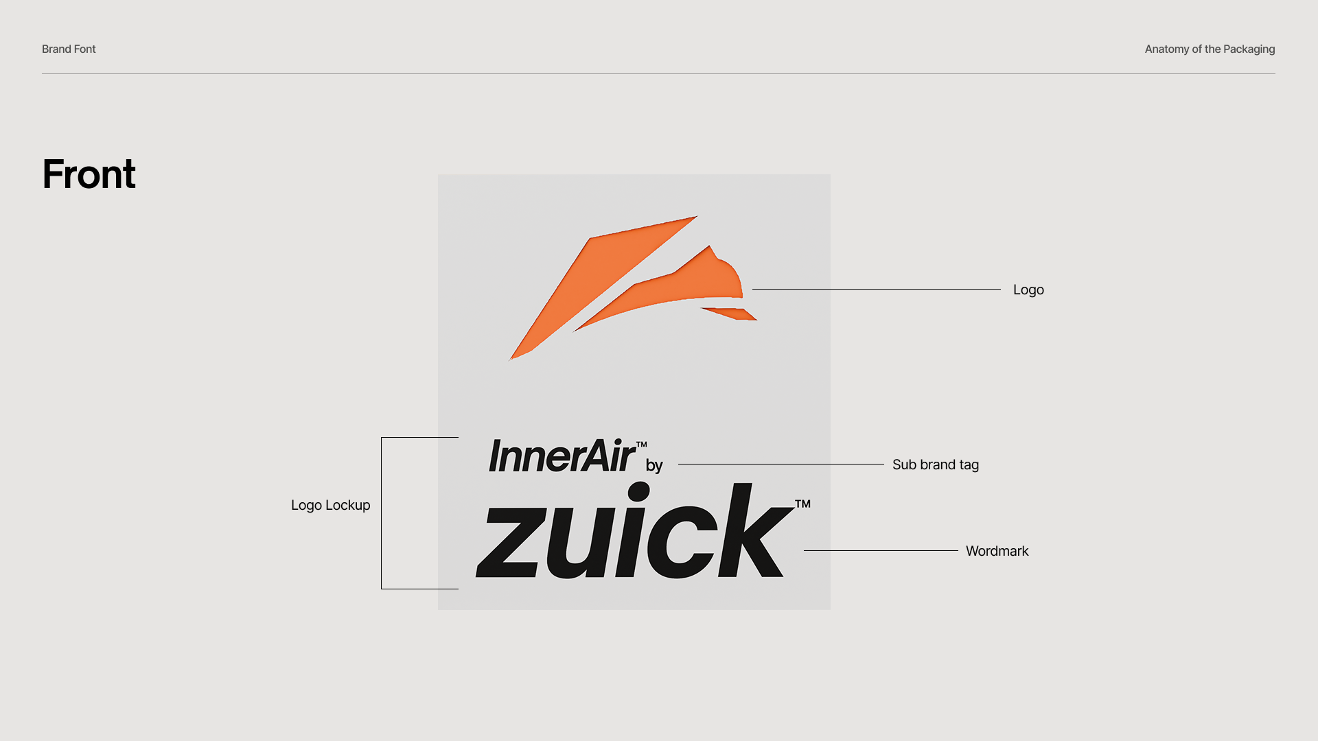
The squirrel became the central mark, capturing the constant jumping, running and movement of children. Its simple form kept the identity mature, while the electric orange gave it the youthful energy the brand needed.
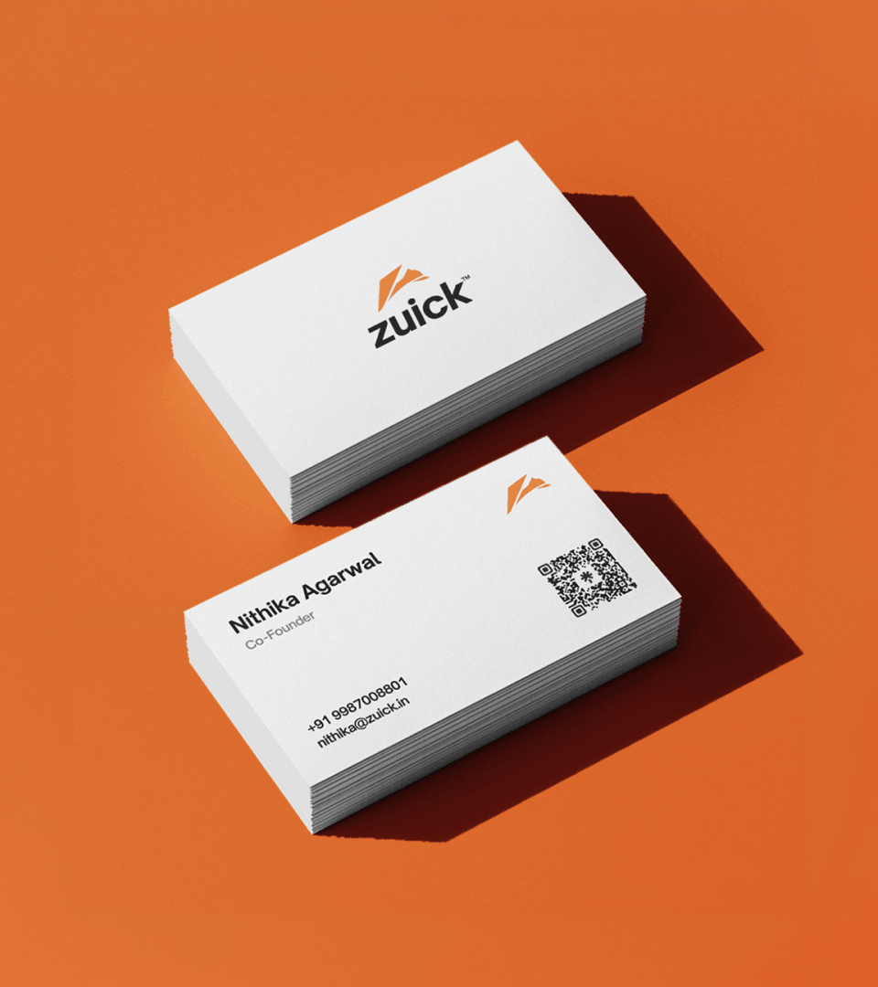
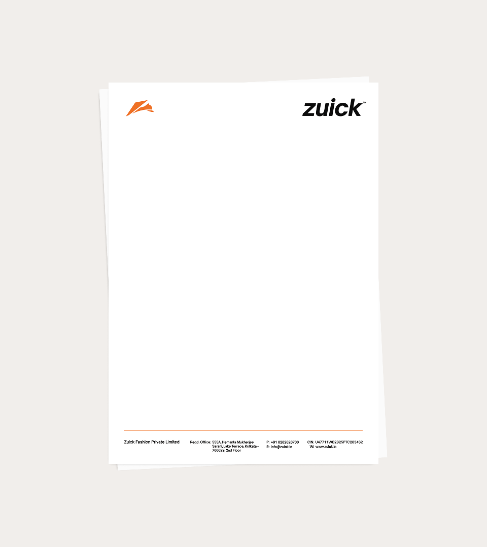
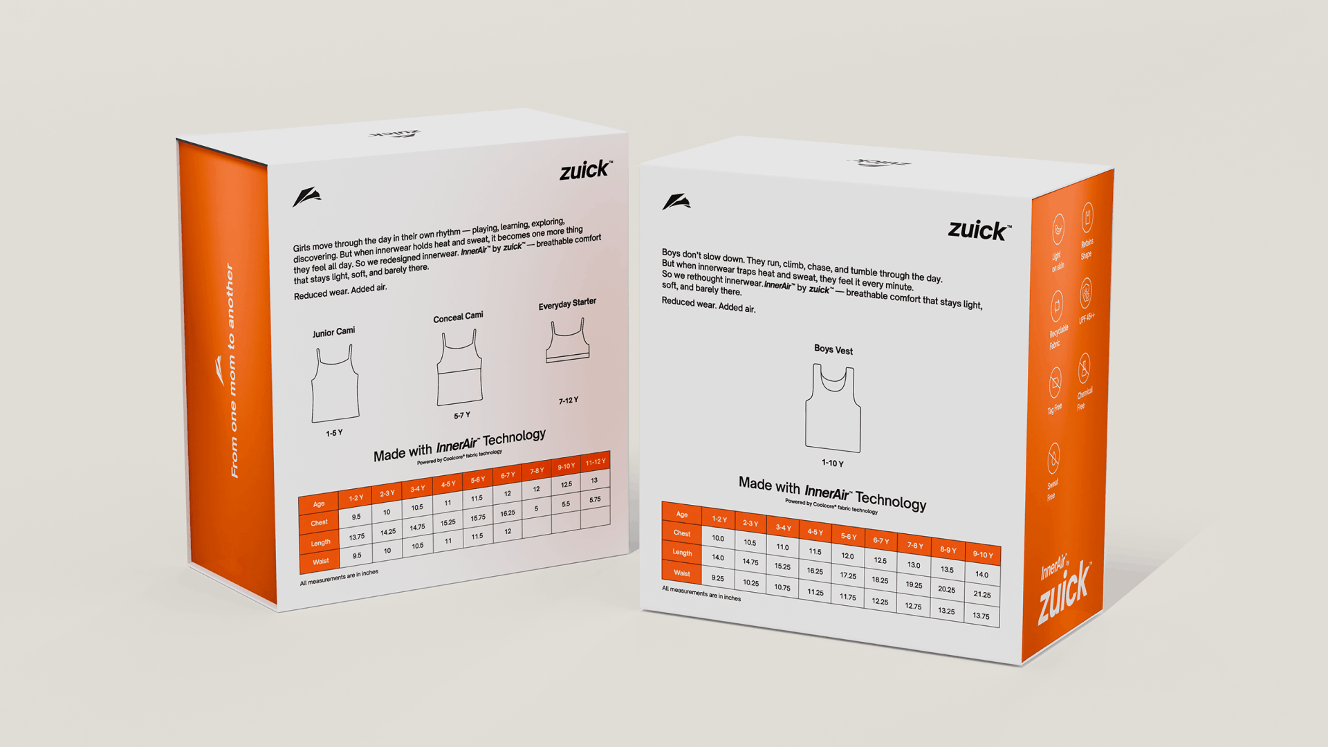
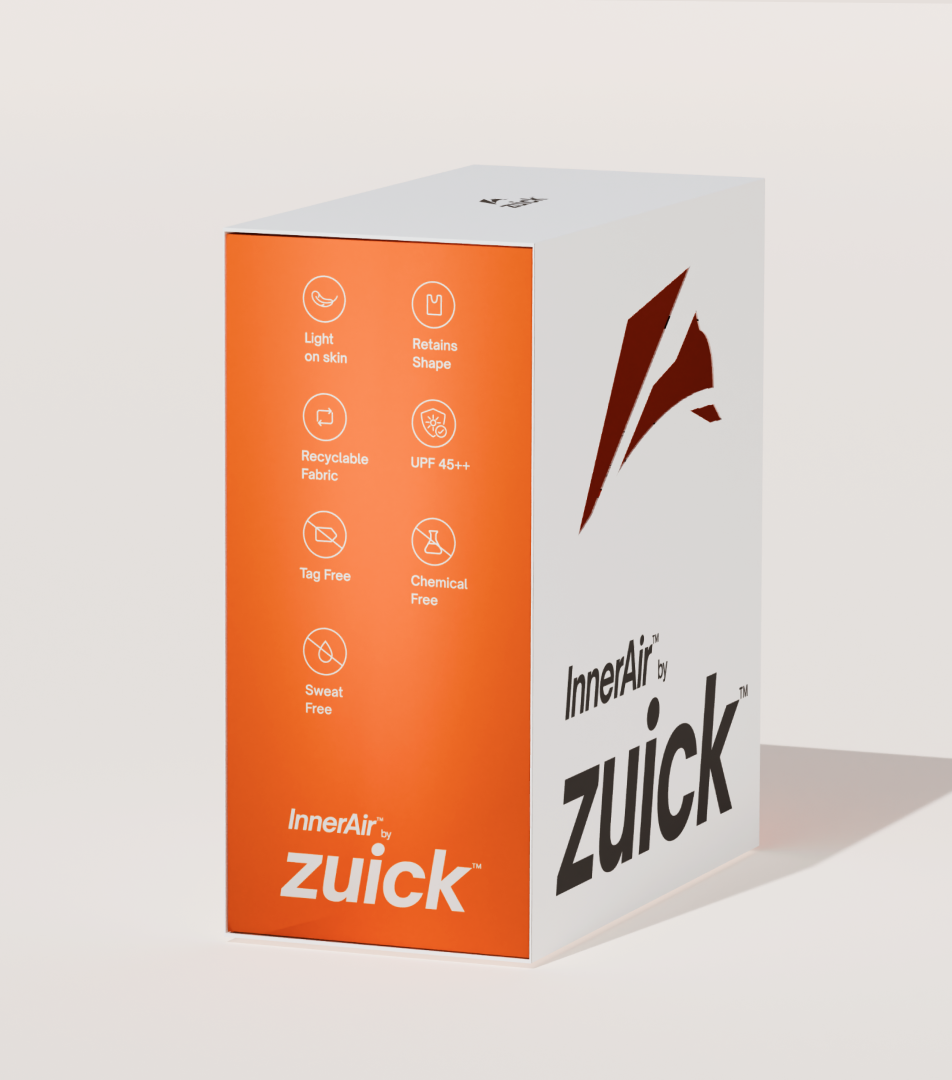
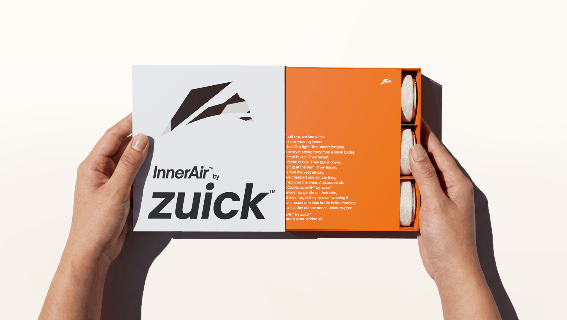
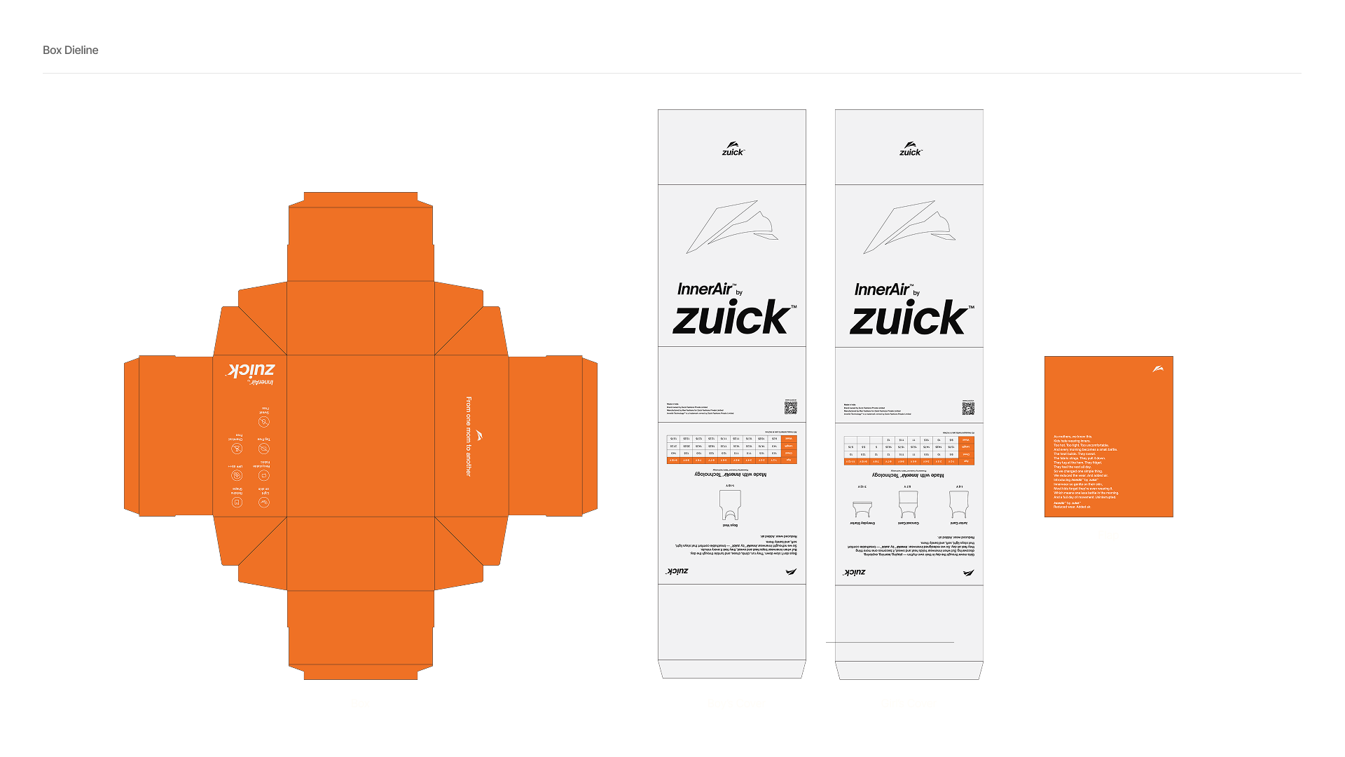
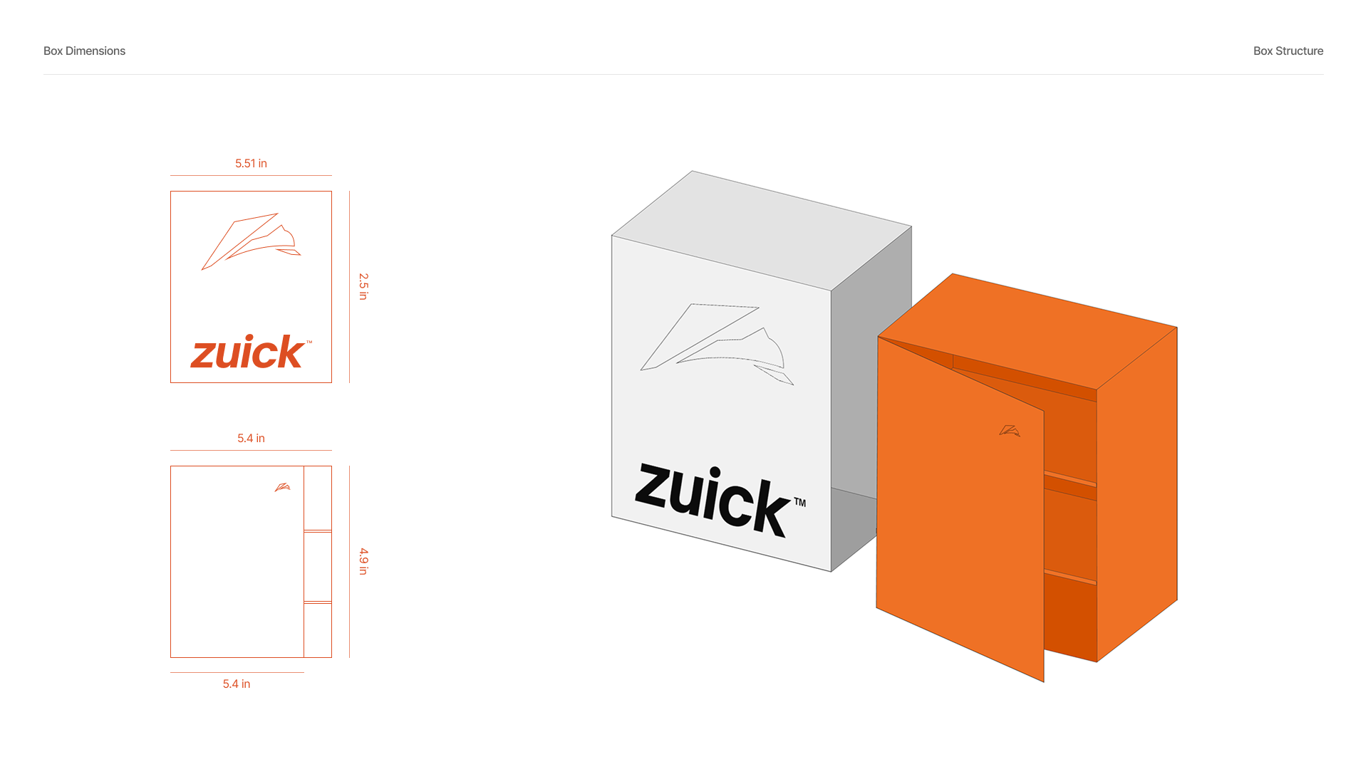
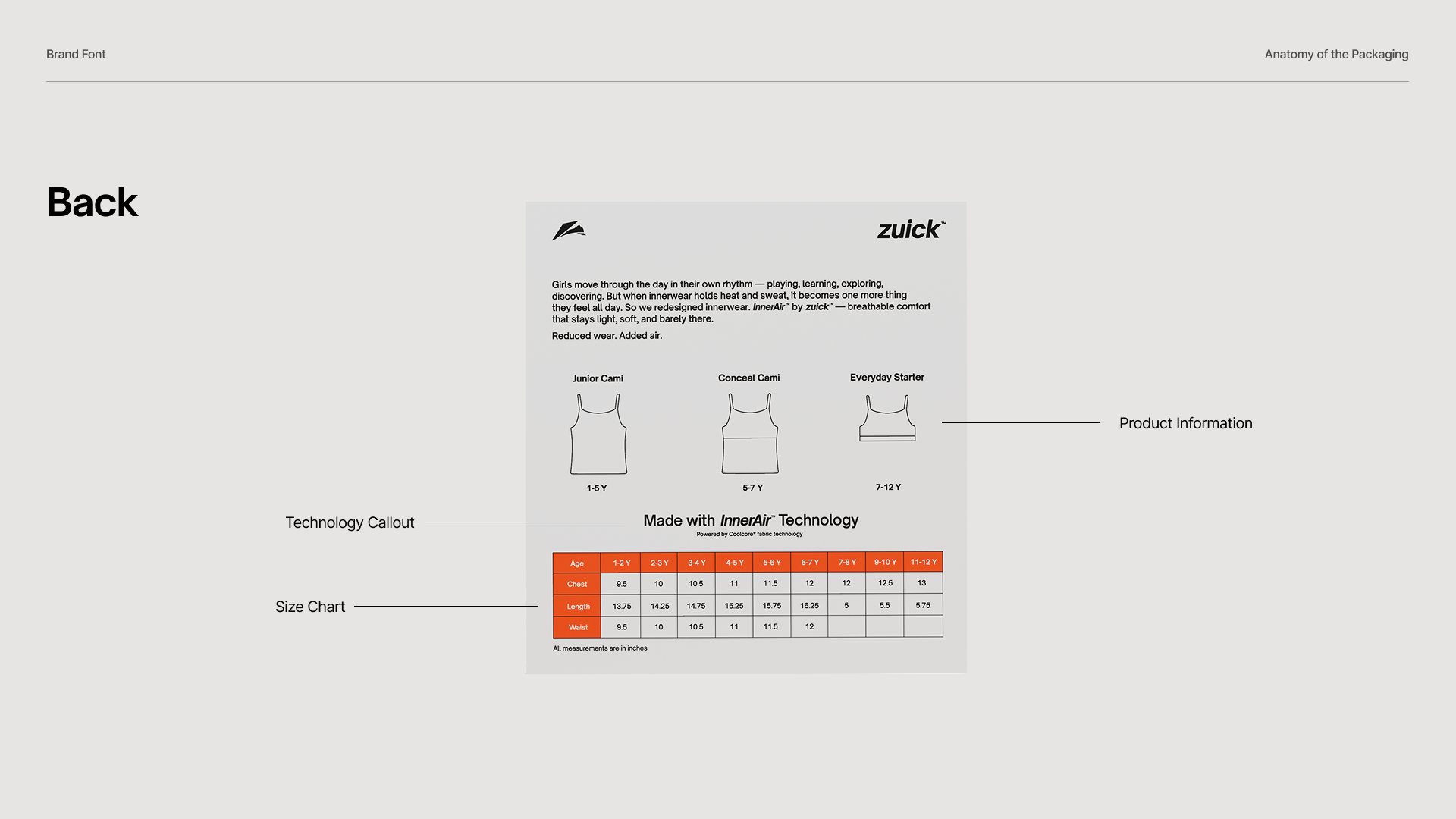
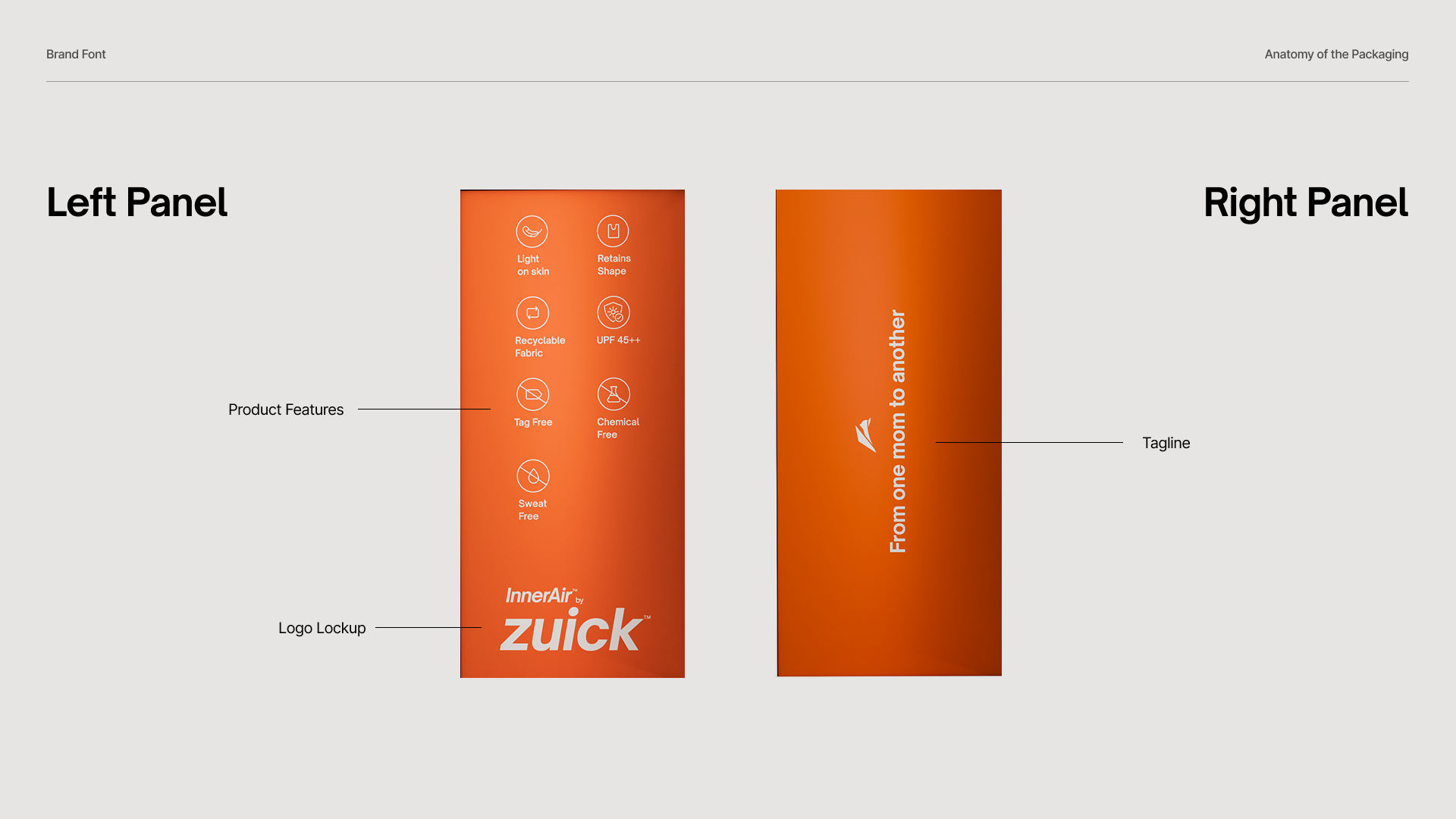
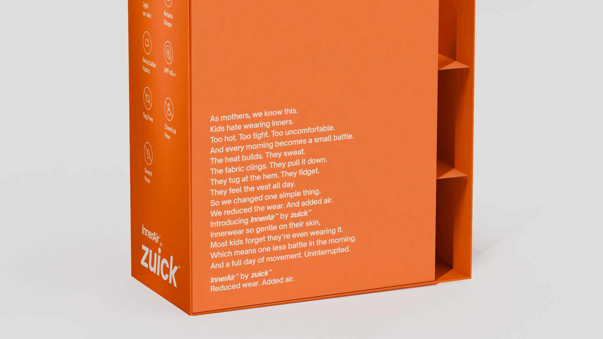
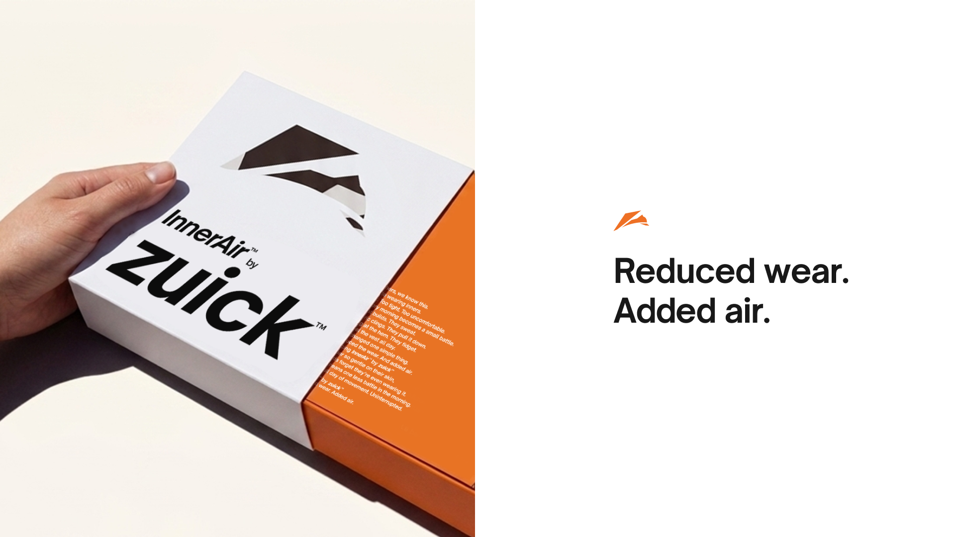
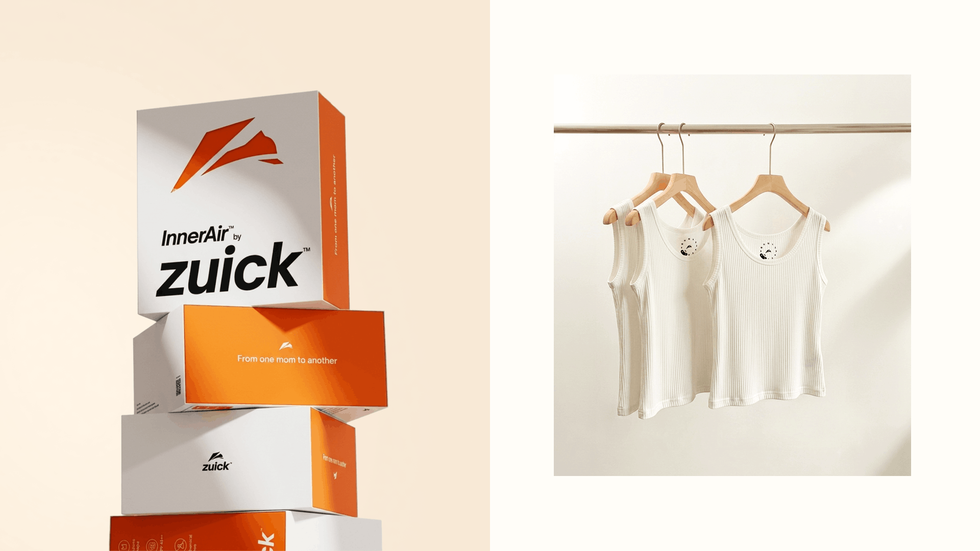
The packaging followed the same philosophy — clean, restrained and internationally influenced. Instead of filling the packs with graphics and colour, we gave the product room to breathe, helping Zuick feel more sophisticated and premium on shelf.
Takeaway
Sometimes the easiest way to look different in a category is to stop following the visual rules everyone else is following.